Hello fellow EcchiDreamers!
As promised I'm making another announcement although it's probably going to be a small one, to keep you up-to-date on the changes we've been making to EcchiDreams over the last few weeks. There's been no major changes that's going to require re-learning of everything, just little changes here and there to look and be "More Presentable". 😄
In the last update I spoke of a few things that I knew needed to be fixed or changed in someway in "plans for the future" so what I will do is report on these fronts first before getting into the other cool changes.
QuoteImprovements to Roleplayer Preferences
We have some ideas penned out for an update to our EcchiApp: Roleplayer Preferences. At the moment, this is rather basic, albeit very functional; however, we want to bring more information, settings, and customisability to it, while keeping the interface easy to use and intuitive. The basic idea is that you’ll want to spend ten or fifteen or so minutes filling it all out, and yet only take a fraction of that time actually reading it, because while you might not be editing it everyday, it could be read everyday.
We are currently working on an update to this, although we don’t have any time scales or release deadlines, as the improvements are in the very early stages.
Not that much has been changed here; the forms are still the same format and so on, but we have included a few things that I personally think is good to have on the page in that section for both mobile and desktop users alike. I've put some stuff into the sidebar of the Roleplayer Preferences that are relevant to what roleplayers are looking for as well as a roleplaying advert (Link requires being logged in), as well as the latest roleplays from our Public Roleplaying Section, and latest BBS posts from our Private Roleplayers Bulletin Board and finally a Dashboard button for easier navigation. Of course I should point out in being completely honest: When I spoke of the changes in the last announcement, I spoke of bigger changes that meant an easier time actually filling out the form; and viewing other preference sheets. This is still being designed, worked out, and there is still no date.
Similarly the Private Roleplayers BBS has had a few changes done to it too, specifically in the sidebar.
QuoteCommunity Help and Support Unification
Hopefully before Christmas 2016, we’ll have made an update to the Community Help and Support Section, to help Dreamers better get the help they need. By this time, we hope to have more FAQs in our new FAQ system, as well bring in the bug tracker to be a part of the section. By January 2017, getting help and support should be a lot easier and more intuitive, as well as being mobile and guest compatible.
This is still being worked on, and I'll be working through November to get this done by the promised deadline. I will say this however - we've scrapped the bug tracker system. So, this is obviously a big thing that I will need to discuss next, but before that... We have a lot of avenues for getting the support you need, as quickly as possible. You can:
- Use the "Contact Us" link at the bottom left of our page.
- Send an EcchiText to any of the staff members.
- Ask a question in the Community Questions forum; this is where anyone from the community, or staff can answer you. Popular questions will even make it to our FAQ's.
- Try and find a tutorial. Or even make one.
- Read our FAQ's.
QuoteBug Bounties
We aim to be more open as to how many EcchiCredits people will earn through reporting bugs, in the interests of openness and transparency. This should be more clear in the bug tracker section before the end of October.
This is complete but it also has been pretty much scrapped all together. "Pretty much" being the operative words there. I have decided to do away with the bug tracker (at least from the public point of view) because it either made more confusion for everyone involved, and because most people sent Manni, Neptune or even me an EcchiText saying they 'think' they've found a bug. That seems like a pretty simpler solution to me, and boy do we need simpler solutions for things. With that said I will still be handing out 'rewards' or 'bounties' in the form of EcchiCredits to those that tell us these things and we deeply appreciate it too.
The bounties are as follows, for non-security related bugs:
- Badly worded/Grammatical/Spelling Mistakes - Variable
- Low Severity - 100 EcchiCredits
- Medium Severity - 250 EcchiCredits
- High Severity - 500 EcchiCredits
- Severe Severity - Upto 1,500 EcchiCredits
- Critical Severity - Upto 2,500 EcchiCredits
The bounties are as follows for security related (which are extremely rare) bugs:
- Minor Security Flaw/Bug - 2,500 EcchiCredits
- Major Security Flaw/Bug - 5,000 EcchiCredits
- Critical Security Flaw/Bug - 10,000 EcchiCredits + Bonus
To report a bug; just send any of the staff an EcchiText, you'll be credited in the bug report. The first person to report a specific bug is the person who will get the EcchiCredits; as a result anyone who reports a pre-existing bug will be told that we know about it, but thank you. I think this system is very fair.
IMPORTANT REMINDER!
When you tell us of a bug, any screenshots, the page URL and your browser name (and version if you can help it) would be valuable information to us for tracking it down. Steps you took to get to the bug is very important to us; as it allows us to try and reproduce the bug. Thanks!
QuoteExternal Site Link Information
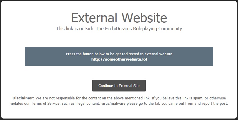
Hopefully, by next week, we should have a new system in place that alerts you that you’re leaving EcchiDreams when clicking a link that takes you away from this site. This will also host our disclaimer that we’re not responsible for the content of the site you’re being linked to, nor is it to be considered an endorsement, yadda yadda yadda… You know, all that ‘legal’ stuff, and information that should basically say something along the lines of ‘If you believe this link to be malicious, spam, or otherwise in violation of our ToS, please go back and report the post so that it can be reviewed by staff.’
This system is now up! Test for yourself with this link:- https://google.com/ you should get something like this:

Maybe I can apply a little humour to it? Like you are now probably leaving the dark corners of the internet. Lol.
There is no updates to the Awards and EcchiCredit systems; other than we updated the EcchiCredit one to fix some bugs that staff picked up on. Now we get down to what I didn't announce would be changing but has in fact changed other than the myaid of tweaks and fixes no one wants me to bore them with.
Homepage Changes
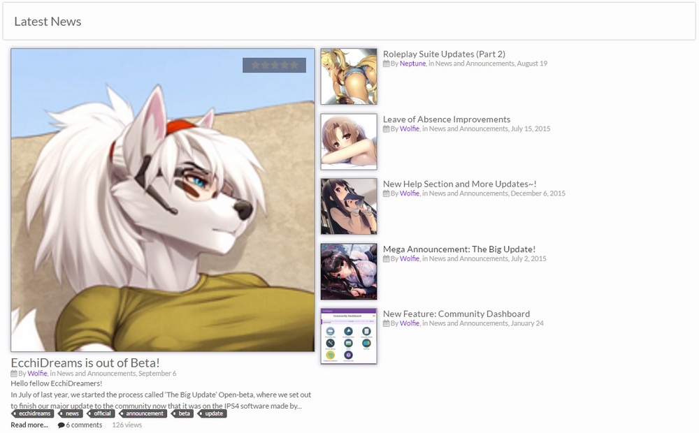
On our homepage (when you're logged in of course) I've made a number of changes that has radically altered the layout of the page. Such as latest news articles has a prominent feature under the userbar.
The sidebar has also been re-ordered, so that the Roleplay Adverts appear above the fold.
Profile Changes
The profile cover is now slightly larger! @Neptune pointed out that the profile covers were too small, and as such it sucked as to what images you could put in there and how much of the image would be displayed. This has now been increased so you can make more out of your image of choice to make your profile, your own.
Site-wide/Non-specific or Misc Changes
We, proudly, use a "Skin" from IPSFocus, called Shift, which I've heavily modified for use on our website, who have made a number of improvements since the last update, such as tweaks for mobile users with the colour picker and general optimisations as well as minor tweaks. You may have noticed axes, spiders and bats around - this is because (built into what you get from IPSFocus) seasonal things during Halloween, Christmas and Valentines Day. We've always (except for last year) done something over Christmas and this year we'll be doing something beyond flicking a switch.
The Roleplayer Advert Terms and Conditions have also been changed to increase the amount of days you get with an advert post from 14 days to 28 days at the same cost.
Post Counts
A lot of you will have noticed that your post count has plummeted (including mine which was at 9,200 odd and now is down to 4,600 or so...) This is because of a cleanup that removed topics that haven't even been visible for a better half of this year (such as when we did the roleplaying changes). Of course I've also cleaned out my old development suite which had lots of posts and such that were made during the Beta period, which was never (and never intended to be) public. This is more of a correction to the record, rather than just us arbitrarily going on a deleting spree.
News Articles
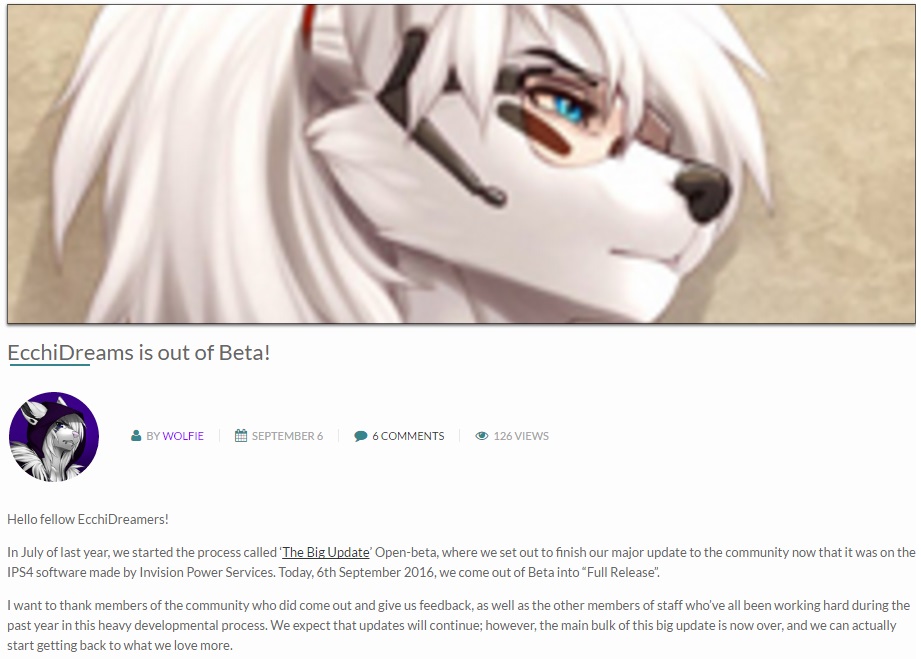
Our news section has had massive changes. Previously our articles were in the same format as much of the site, and it wasn't that great... Now they actually look like articles rather than in the exact same format as the tutorial section. Obviously we'll be making tweaks over the coming weeks but this is an example, which you can see as you read this too:

Because of the changes to the news articles and their altered the formatting: Limits that were originally placed, such as the fact that we only used JPGs that were 200x200 (doesn't look good on the new format) have been lifted. I plan on rolling this out to the community articles section by next year as well, so we can see better quality things coming out a lot more frequently in future.
And that's pretty much it, in the spirit of keeping to our facebook stuff I will be doing something else different at the end of each News Article, depending on if its wanted or not (Leave a comment). I use images that I pick up from places like Pixiv, Yande.re and so on, as such these images have copyrights which absolutely belong to the respected artists. In the keeping with our tradition though, I'll be giving more than just an image credit by saying what I personally like about the image, why I chose it and where you can go to find more of their art. This - I hope - will be seen as a sign of respect rather than "OUR IMAGE NAOW!!!" which is not what it is at all. I want more artists, and I want the artists that have done a good job on something to get the credit they're due, and to funnel people who genuinely like their art to seek them out. That said if you're an artist and you're not happy with this - please get in touch with me and I will add you to a DNP (Do not post) list that will apply here on EcchiDreams, and on Facebook (or wherever else we do this service).
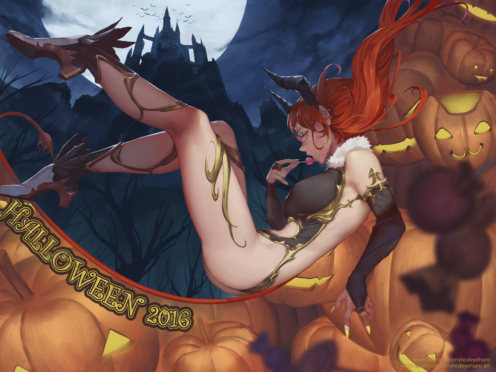
Image Credit:
Artist: RedEyeHare
Links: ArtStation | Pixiv | Deviant Art
Other than the fact that it was relevant I used this picture because it's exactly what I was looking for when I thought 'Ecchi, Halloween, Good Quality and Potentially Triggering' and I really like it. I think the level of detail and yet not looking complicated, is something that seems to be a dying art. I think it's perfectly balanced and absolutely reasonable. The colours work well together, and of course the rather devilishly attractive lady is very fitting for the picture. It's very well drawn, indeed! It's certainly something I appreciated looking at and I hope you do too. I highly recommend checking out their art - I've had a look myself and I've found a few other pictures I really liked the looks of too.
Thank you for reading. We're EcchiDreams, wishing you a very Ecchi Halloween.


Recommended Comments
Create an account or sign in to comment
You need to be a Dreamer in order to leave a comment
Create an account
Sign up for a new account in our community. It's easy!
Register a new accountSign in
Already have an account? Sign in here.
Sign In Now