How to create an attractive Home Page for your Club!
Use of Images
Images can be quite a powerful tool for your Home Page. They’re eye-catching and they can grab the attention of anyone that is browsing around your club. They’re also an extremely good way to visualise things to potential Roleplayers.
Perhaps the first thing to start off with, is giving your Home Page a title. It could be as simple as stating your Roleplay name. Or, you could be a bit more personal and have something such as “Welcome to…” and then put your Roleplay name. Or, “Come on into…” and again, have your Roleplay name. It would be a good idea to bold, and underline the title as well as to make the text larger so that it is immediately visible at the very top of the page.
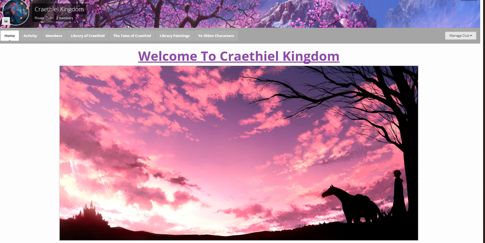
Just underneath the main title, I like to place a nice eye-catching image that is relevant to the roleplay;
The image itself is fairly large and very eye-catching. The colours of the image match very well with both my cover image, and my icon, with its pinks and blues. It matches the theme of my Roleplay by having a silhouette of a castle on the left, as well as having a figure with a horse on the right next to the tree.
It’s best to go for large, or medium sized images for your Home Page. Small images are hard to see, and might make the page look sparse and lackluster. If you come across an image that you would love to use, but seems far too small for what you want, you can also attempt to right click it, and search Google for that image. You might come across a larger image, although you need to be careful not to pick out anything that has been artificially enlarged as that can cause blurriness and blockiness which would look very unattractive. You could also search for similar images and find another that you could use instead of the small image.
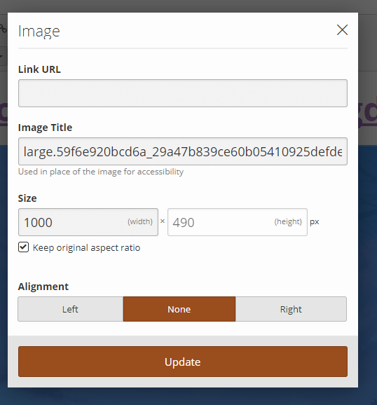
If you pick an image that is perhaps a little too large to put into your Home Page, you could use an outside program such as GIMP or Photoshop to clip it down in size. If you’ve already uploaded it to EcchiDreams and have it in the editor, double click on the picture and you will see this:

This will allow you to not only edit the size of the image, but to also dictate where in your post it will be going via the alignment settings. For smaller images, it would allow you to put text beside it instead of having a large white space where nothing it happening.
Another image that you could definitely include on your Homepage, is one of the images from the Roleplay Difficulty Guide, which clearly shows the difficulty of your Roleplay with an easy to understand visual representation. For my Roleplay, I included this image underneath my main Home Page image as well as the spot where I have marked for my main Roleplay Information. I also centered the image so that it is clearly visible. This is because I want it to be one of the first things a Roleplayer sees so that if they do not feel they are up to the Difficulty level, then they’re aware straight away. I also put a little information regarding the absolute minimum expectations:
I ensured that the text was centred as well, and was of a font size that is easily readable to anyone looking at my home page. I kept the information regarding the difficulty short, simple and to the point. I don’t need to embellish myself, nor get too complicated.


