How to create an attractive Home Page for your Club!
Tips and Tricks
Using Images as titles
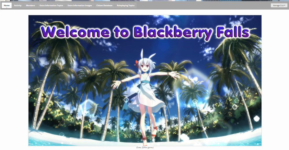
Remember above I spoke about utilising images in your Roleplay? As well as putting a title at the very top of your Page? Well why not combine the two? Using an image editing program to add text to your image can achieve these two purposes easily so that you get an effect like this:
Roleplay Difficulty Image
The image that I showed off above, that was a nice clear indicator of the difficulty level? Well it’s pretty easy to find it, and include it into your Roleplay. The images are here, in the Roleplay Difficulty Guide. Find the one you want, and right click on it and copy the link (The option “Copy Image Address”). Then return to your Home Page editing page and in the bottom right corner, click on the “Insert other media” menu to open it up. When it has, select “Insert image from URL” and when the dialogue box appears, insert the link and click the purple “Insert into post” button. Then the image will appear into your post and you can format it to your liking.
Colour
Make the use of colour in your Home Page, although don’t make it look like someone tie dyed the page. Keep your colours consistent, and compatible with not only other text colours but also with any of the images that you use. You don’t want to make your page look garish and over the top. You also don’t want to pick colours that cannot be read off of the white background. See here for a guide on good text colours to use.
Readability
Try and keep things as neat and as uniform as possible. Titles could perhaps be bolded, underlined with the text being larger than the body text. But try not to mix and match formats and text sizes in the same sentence. It will look messy, and it will be unreadable.
Not only that, but try not to make text too large, or too small. Too large, and it’s difficult to read through the text which will be broken up especially for mobile users and those with smaller screen resolutions. If your text is too small, it will force Dreamers to have to magnify just so that they can read it and it may be hard on the eyes.
Try and keep body text a consistent size across your entire Roleplay. For example, text size 14 in the text editor is a good size. It’s readable on both large, and small resolution screens and it is perfectly readable on mobile phones. For small section titles I use the next font size up; 16. I will usually also bold and underline them to make them stand out. For main titles, I tend to make them a large larger, perhaps even going as high as font size 36. I will bold and underline, and change the colour as a main title really should stand out from the rest of the text without being too messy about it.

